

When dealing with a lot of data, it's not easy to visualize them on a usual plot. For instance, if you want to plot coordinates data (like the NYC taxi dataset), the picture will be rapidly overwhelmed by the points (see below).
The purpose of this post is to show a scalable way to visualize and plot extremely large dataset using a great Python library called Datashader (from the same project as Bokeh).
Without Datashader
When using a classic visualization tool like Matplotlib, due to the great amount of points to render, the result looks like....
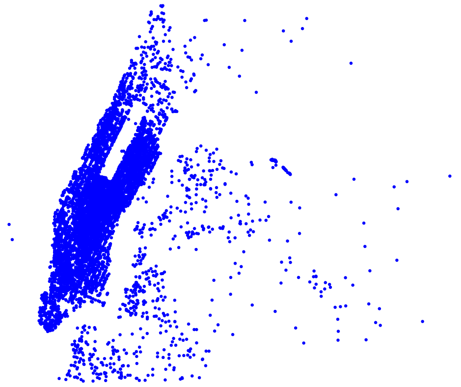
Fig 1 - Overplotting when using Matplotlib
This overplotting is because of the limitation of the marker size and because every individual point is uniquely rendered, ie. in the case of visualization on the browser, each point is encoded in JSON and is stored in the HTML file. At scale, this becomes impossible and not smoothly rendered. However, with interactive plotting library like Bokeh, these points are distinguishable when zooming, but this is not suitable when rendering the whole image.
With Datashader: Projection, Aggregation and Transformation
This is the main 3 steps for Datashader to produce a visual representation of the data.
To sum up the process, Datashader divides the computation of the data from the rendering.
During the process, data are aggregated into a buffer with a fixed size which will be eventually become your final image. Each of the points is assigned to one bin, in the buffer, and each of these bins will eventually transformed into a pixel in the final picture.
For more detailed explanation, refer to this video.
Setup and tools
For this project, I used the same AWS EC2 cluster in the previous post. The dataset to plot is the Green NYC dataset pickup and dropoff GPS coordinates (7 GB). The process describes here can be applied exactly the same way to Yellow NYC taxi dataset (200 GB), you just have to add more EC2 instances to your cluster, or wait a few hours for the computation time.
However, two additional tools are used which are:
- Spark/PySpark, to query the Hive table using SQL HiveContext
- Parquet, a columnar storage format, that is used to temporary store only the columns of interest (4 columns, pickup/dropoff latitude/longitude)
- Dask the Python's Pandas for large dataset that doesn't fit in memory.
- Datashader for the visualization
You can find all the dependent packages in this file.
From raw data to the visualization, there are 5 steps:
- Retrieve Hive table (which points to external S3 bucket) via pyspark.sql.HiveContext
- Fetch only the pickup and dropoff longtitude/latitude fields and convert it to a Parquet file
- Load the Parquet into a Dask dataframe
- Clean and transform the data
- Plot all the points using Datashader
The following illustrates the different steps:
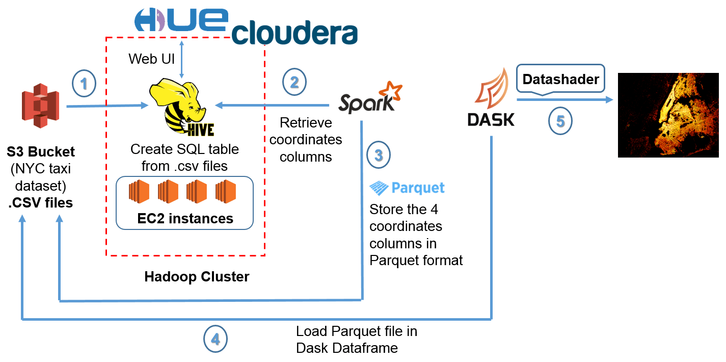
Fig 2 - Overall workflow from raw data to visualization
Retrieve data from Hive table
Here, I use Spark's HiveContext to fetch data that's a linked to a S3 external bucket. Especially, I use the package findspark to be able to use PySpark on a Jupyter notebook.
A snippet for this operation is like:
import findspark
findspark.init()

import pyspark
from pyspark import SparkContext
from pyspark.sql import HiveContext

sc = SparkContext(appName="green taxi with Dask")
hiveContxt = HiveContext(sc)
Fetch longitude/latitude columns
The columns of interest are only the 4 columns containing pickup latitude/longitude and dropoff latitude/longitude:
query = "SELECT pickup_longitude, pickup_latitude, dropoff_longitude, dropoff_latitude FROM green_taxi"
results = hiveContxt.sql(query)
results.cache()
Retrieving the columns is a transformation operation, so it's lazy evaluated, which means that it's done almost instantaneously. To put in simply, Spark will add the operation to its DAG (Directed Acyclic Graph) scheduler, that divides operators into stages of tasks. The particularity of the DAG, it's the fact that it's doesn't loop back, and is a straightforward sequence of tasks. Then, the computation only happens when an action occurs, ie. aggregation etc...
You can visualize the DAG by going to: <driver_public_EC2_IP:4040>, then check the stages of your job. Here's an example:
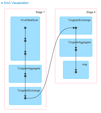
Fig 3 - Example of a Spark DAG
Export the coordinates to Parquet
A quick step to later on allow Dask to load the file as a dataframe.
results.write.parquet("s3a://nyctaxidataset/parquet_taxi/green_taxi_coord.parquet")It's better to load from a Parquet file rather than massive raw and multiple CSV files. The more and powerful your EC2 instances are, the faster you write the Parquet file. You can also specify the type of compression (like gzip, bzip2 ...), the default type is Snappy. Once the Parquet is successfully written to your S3 bucket, the content of the file will look like this:
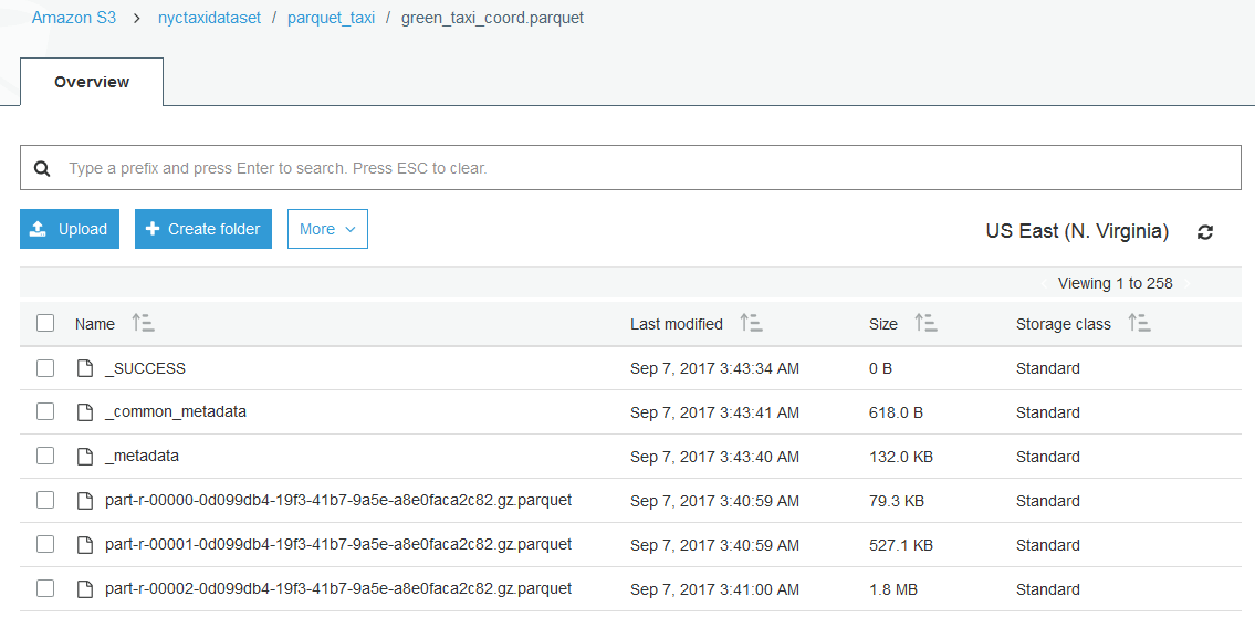
Fig 4 - Content of a Parquet file
Using Dask for data processing
Launching a "Dask cluster"
Dash is the big data equivalent of Pandas in Python. Why not directly using PySpark for data cleansing and processing? The reason is simple, Datashader doesn't support PySpark dataframe, but only Pandas and Dask dataframe. Besides, I've opened an issue on GitHub, but there is no support so far yet.
Now, refer to the requirements file for the dependencies packages to be installed.
Once all the packages are properly installed, run the following command:
dask-ssh IP1 IP2 IP3 IP4 --ssh-private-key <YOUR_PEM_FILE>.pemThe .pem file is the same used when creating your EC2 instances. By default, the scheduler node (similar to a master node) is the first IP address, and the others are workers. If everything went smoothly, you should see something like this:
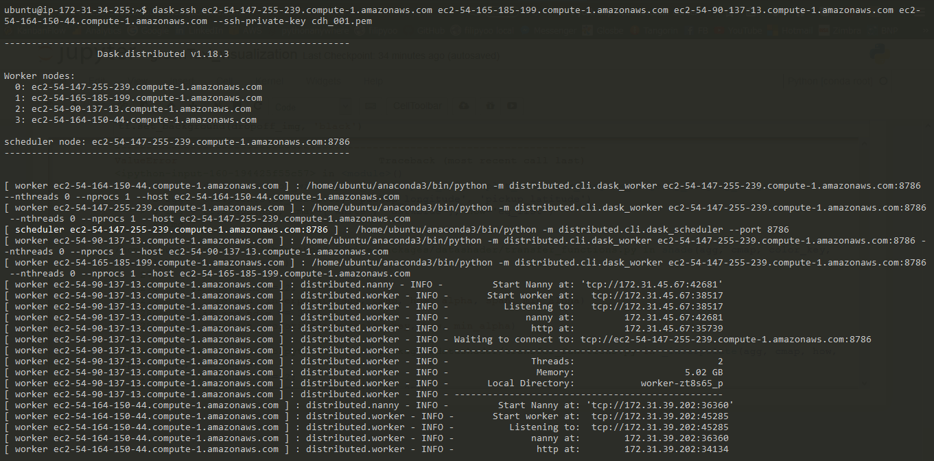
Then, on your Jupyter notebook run:
from dask.distributed import Client, progress
client = Client('127.0.0.1:8786')
client
You should be able to see the total number of workers, cores, RAM of your "Dask cluster" like this:

Dask comes along with an interactive Bokeh-based dashboard accessible via <scheduler_EC2_public_IP:8787> (and not the localhost address since we use AWS instances).
Load the Parquet file into a Dask dataframe
Simply use the following line:
import dask.dataframe as dd
from dask.distributed import progress
df = dd.read_parquet('s3://nyctaxidataset/parquet_taxi/green_taxi_coord.parquet',
                storage_options={'key':'<YOUR_AWS_KEY_ID>',
                                  'secret':'<YOUR_AWS_SECRET_KEY>'})

df = client.persist(df)
progress(df)
This will show a UI tracking the progress directly on the notebook.
Clean, filter and transform the coordinates data
We start with getting rid of NA data, and out of acceptable coordinates value range:
# Filter all zeros rows
import pandas as pd

df_mercator = pd.DataFrame()
df_mercator = df[(df.pickup_longitude != 0) & \
                (df.pickup_latitude != 0) & \
                (df.dropoff_longitude != 0) & \
                (df.dropoff_latitude != 0)]

df_mercator = df_mercator.dropna()

# Filter rows with out of range longtitude/latitude
df_mercator = df_mercator[abs(df_mercator.pickup_longitude)<180]
df_mercator = df_mercator[abs(df_mercator.pickup_latitude)<90]
df_mercator = df_mercator[abs(df_mercator.dropoff_longitude)<180]
df_mercator = df_mercator[abs(df_mercator.dropoff_latitude)<90]

df_mercator.describe().compute()
Convert longitude/latitude to Web Mercator format
Plotting directly raw coordinates data won't result in a good representation. Why? The Earth is round, and to see GPS coordinates on a flat picture, we have to do a projection. There are many types of projection, but one of the most common is the Web Mercator projection, also used by Google map. If you don't project your GPS coordinates and try to plot directly the data, you might have something like this...

Fig 5 - Unprojected plot of the NYC taxi dataset
You see know how it's important not to use the raw GPS coordinates. Instead of writing by yourself the mathematical conversion formula, you can use the pyproj to write a mapping function like below:
# Convert longtitude/latitude to Web mercator format
from pyproj import Proj, transform

def toWebMercatorLon(xLon):
    mercator = transform(Proj(init='epsg:4326'), Proj(init='epsg:3857'), xLon, 0)
# longitude first, latitude second.
    return mercator[0]

def toWebMercatorLat(yLat):
    mercator = transform(Proj(init='epsg:4326'), Proj(init='epsg:3857'), 0, yLat)
    return mercator[1]
The ESPG parameter allows different types of projection.
Then, we map the proper function (latitude or longitude) to the columns of our dataframe:
df_mercator['pickup_longitude']  = df_mercator['pickup_longitude'].map(toWebMercatorLon)
df_mercator['pickup_latitude']   = df_mercator['pickup_latitude'].map(toWebMercatorLat)
df_mercator['dropoff_longitude'] = df_mercator['dropoff_longitude'].map(toWebMercatorLon)
df_mercator['dropoff_latitude']  = df_mercator['dropoff_latitude'].map(toWebMercatorLat)
Map visualization: NYC green taxi plotted
The funny part! Here we use Datashader to visualize the data. The different steps are:
- Create a canvas: describing the size (width/height), the color map of the final picture.
- Aggregation: this is where all the computation is done, and takes the most time.
- Display: you can choose how to display the picture based off the distribution of the data.
Defining the canvas
Credit to Ravi Shekhar, for the definition of the width/height/center of the canvas.
Here's the code snippet:
import datashader as ds
import datashader.glyphs
import datashader.transfer_functions as tf

# Define Canvas
x_center = -8234000
y_center = 4973000

x_half_range = 30000
y_half_range = 25000

NYC = x_range, y_range = ((x_center - x_half_range, x_center + x_half_range),
                          (y_center-y_half_range, y_center+y_half_range))

plot_width  = 400
plot_height = int(plot_width/(x_half_range/y_half_range))

cvs = ds.Canvas(plot_width=plot_width, plot_height=plot_height, x_range=x_range, y_range=y_range)
Aggregation and display
Once the canvas is set, you'll have to choose the type of plot you want. Here your want a scatter plot, so the method canvas.points() will be used. It's in the aggregation phase that all the computation happens, and you can check the progress on the Dask dashboard mentioned previously. Here's how it looks like:
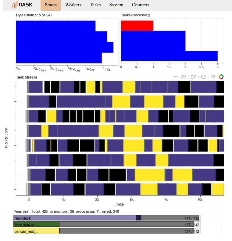
Fig 6 - Dask interactive dashboard
As for the display, you need to use the tf.shade() method that will convert a data array to an image by choosing an RGBA pixel color for each value like below:
cmapBlue    = ["white", 'darkblue']
dropoff_agg = cvs.points(df_mercator, 'dropoff_longitude', 'dropoff_latitude')
dropoff_img = tf.shade(dropoff_agg, cmap=cmapBlue, how='linear')
The important thing to note here is the parameter how. This specify which interpolation method your want to use. For instance, below is for a linear interpolation method:

Fig 7 - Plot of the NYC green taxi dataset with linear interpolation method
Basically, we barely see the shape of the New York City. Why? Because the dataset is not distributed evenly, so the points that you see represent only the crowded areas. In a linear scale, we can only see the most "crowded bin" in the Datashader buffer (remember how Datashader works).
So instead, let's try the logarithm interpolation method:
dropoff_img = tf.shade(dropoff_agg, cmap=cmapBlue, how='log')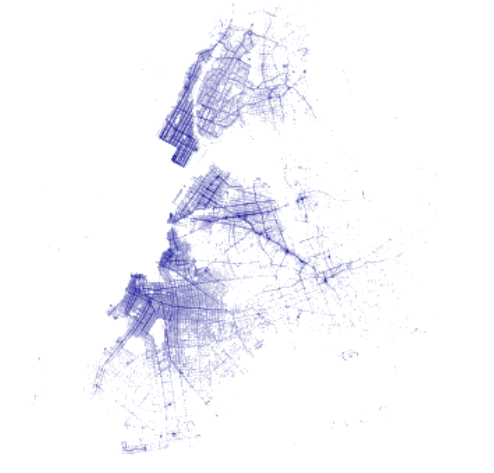
Fig 8 - Plot of the NYC green taxi dataset with logarithmic interpolation method
It's better! It's even better with the histogram equalization interpolation method, that will adjust image intensities to enhance contrast:
dropoff_img = tf.shade(dropoff_agg, cmap=cmapBlue, how='eq_hist')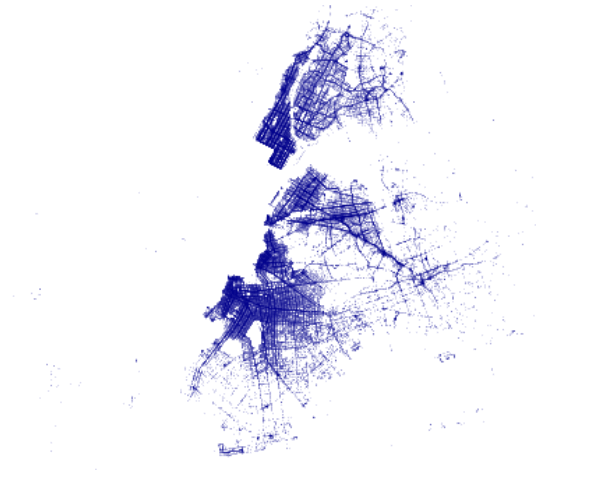
Fig 9 - Plot of the NYC green taxi dataset with equalization histogram interpolation method
The above pictures are taken with only the data from 01/2016 of the green taxi dataset (dropoff GPS coordinates).
The final visualization
Now here's the visualization of the complete green taxi dataset (7.3Gb) with a better color map, and a black background:
dropoff_agg = cvs.points(df_mercator, 'dropoff_longitude', 'dropoff_latitude')
dropoff_img = tf.shade(dropoff_agg, cmap=cmapOrange, how='eq_hist')
tf.set_background(dropoff_img, 'black')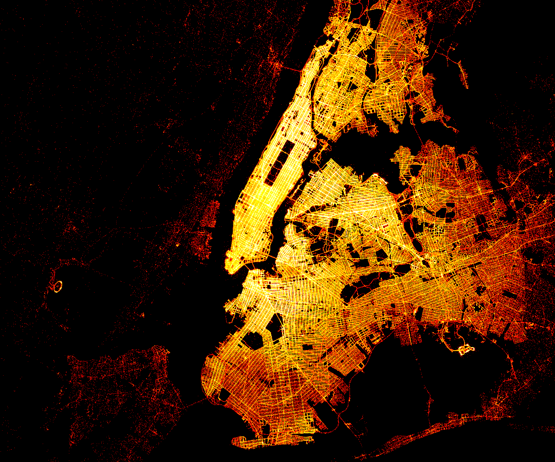
Fig 10 - Final visualization of the NYC green taxi dataset dropoff
Conclusion
In the previous post, I've explained how to setup an Hadoop cluster on AWS and to handle with a large dataset. Here, I've showed the complete process to visualize these large datasets, using Python libraries. Hope that helps!
For the complete code, please check my GitHub repository, especially the Jupyter notebook.


© 2020, Philippe Khin